Powerful MACD Analysis at Your Fingertips

Discover how Finbby delivers comprehensive MACD analysis and trading insights through your favorite messaging apps

Features Overview

Everything You Need for MACD Analysis

Finbby combines the power of AI with technical analysis expertise to deliver comprehensive insights in seconds.

MACD Analysis

Get comprehensive interpretation of MACD signals, crossovers, and divergences for accurate trading decisions.

K-Line Pattern Analysis

Identify key candlestick patterns and price formations for early detection of trend changes and reversals.

Volume Profiling

Understand the relationship between price movement and volume to confirm trends and identify potential reversals.

Support & Resistance

Identify key price levels for strategic entry points, profit targets, and stop-loss placement with precision.

Trading Strategies

Receive actionable trading suggestions with specific entry/exit points and risk management recommendations.

Messaging App Integration

Access powerful analysis directly through Line and Telegram for instant insights anywhere, anytime.

Core Feature

Advanced MACD Analysis

The Moving Average Convergence Divergence (MACD) indicator is powerful but often misinterpreted. Finbby's AI helps you understand exactly what MACD is telling you about market momentum and potential trend changes.

Signal Line Crossovers

Instant alerts when the MACD line crosses above (bullish) or below (bearish) the signal line, with context about strength and reliability.

Histogram Analysis

Track momentum changes through MACD histogram evaluation, identifying increasing or decreasing momentum before price action confirms.

Divergence Detection

Automatically identify bullish and bearish divergences between price and MACD, often the earliest signal of potential trend reversals.

Overbought/Oversold Conditions

Evaluate extreme MACD values in context of the asset's historical movement to identify potential reversal zones.

Try MACD Analysis Now

Sample MACD Analysis Output

MACD Analysis for TSLA (Daily)

Signal Line Crossover:

Bullish crossover detected on May 3rd. The MACD line crossed above the signal line with increasing momentum, suggesting potential upward price movement.

Histogram Evaluation:

Histogram bars increasing in height over past 5 sessions, indicating strengthening bullish momentum.

Divergence Analysis:

No divergence detected between price action and MACD. Price movement aligns with indicator, confirming trend reliability.

Context Analysis:

Crossover occurred near support zone with above-average volume, increasing signal reliability. Previous similar patterns resulted in 5-7% average price increase over 2 weeks.

MACD Analysis Chart

Sample MACD visualization with crossover and divergence indicators

Visual Analysis

K-Line Pattern Recognition

Candlestick (K-line) patterns reveal important market psychology. Finbby identifies key patterns in real-time and explains their significance for your trading decisions.

Reversal Pattern Detection

Identify potential market reversals with automatic detection of patterns like engulfing, hammer, shooting star, doji, and evening/morning stars.

Continuation Patterns

Recognize patterns that signal trend continuation, such as triangles, flags, and pennants, to optimize entry timing within existing trends.

Multi-Candle Formations

Evaluate complex patterns across multiple candles like head and shoulders, double tops/bottoms, and cup and handle formations.

Pattern Reliability Scoring

Each pattern includes a reliability score based on historical performance in similar market conditions for the specific asset.

Try Pattern Recognition Now

Sample K-Line Pattern Analysis Output

Bullish Engulfing
Bullish Engulfing Pattern

Potential bullish reversal

Hammer
Hammer Pattern

Support level identified

Evening Star
Evening Star Pattern

Potential bearish reversal

Doji
Doji Pattern

Market indecision point

Sample K-Line Analysis:

Bullish Engulfing Pattern detected on BTC/USD (4H chart) at $43,250 level. This formation appeared after a 3-day downtrend at a key support zone.

Pattern Reliability Score: 78% - Based on historical Bitcoin price action, this pattern has preceded positive price movement within 48 hours in 78% of similar market contexts.

Key Observation: The engulfing candle shows 2.3x average volume, significantly increasing pattern reliability. Look for confirmation in next 1-2 candles.

Sample Analysis

Complete Analysis Reports in Seconds

Here's what a full Finbby analysis looks like when you send a ticker symbol to our bot. Every aspect of MACD analysis is covered with actionable insights.

Finbby profile picture
Finbby Assistant
Sample analysis report

BINANCE:ETHUSDT (Ethereum/Tether) Technical Analysis Report (Daily Chart)

1. Overall Overview:

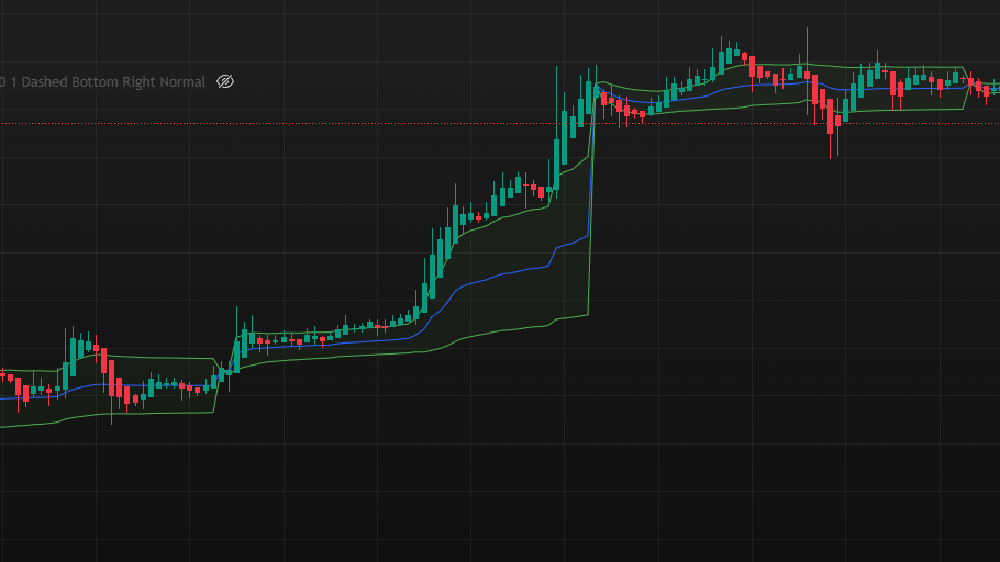
Recent Ethereum (ETH) to USDT price chart shows market sentiment improving after a period of decline and bottom consolidation. Price has recently shown significant upward movement, breaking through the previous consolidation range, indicating strengthening buyer momentum.

2. Candlestick Analysis:

  • Trend Judgment: From a longer timeframe, the previous trend was bearish (downward). However, observing recent movement, price has gained support near ~$1600 and has now exited the bottom consolidation zone, showing a short-term bullish (upward) trend.
  • Recent Pattern: Among recent candlesticks, the most notable is a long bullish candle (large green candle) that powerfully broke through the consolidation platform. This typically represents strong buying interest. The latest candlestick closed at $1782.48, indicating continued upward momentum.

3. MACD Analysis:

  • Cross Signal: In the MACD indicator, the fast line (blue DIF line) has crossed above the slow line (red DEA line), forming a golden cross bullish signal.
  • Momentum Change: The histogram is above the zero line, and its length continues to increase (bullish momentum strengthening). This indicates increasing upward force.
  • Divergence Signal: When price made new lows around mid-April, the MACD indicator did not synchronously make lower lows, instead forming higher lows. This could be an early signal of bullish divergence, suggesting weakening downward momentum and a potential rebound or reversal.

4. Volume Analysis:

  • Recent Change: Observed increased volume coinciding with the price breakout, significantly higher than previous trading days.
  • Price-Volume Relationship: Currently showing a healthy increasing price with increasing volume pattern. The volume expansion confirms higher market acceptance of the current uptrend.

5. Support & Resistance:

  • Support Levels:
    • S1: ~$1600 (Lower edge of the recent consolidation zone) Strong
    • S2: ~$1420 (Near mid-April low) Moderate
  • Resistance Levels:
    • R1: ~$1900 (Near early April rebound high) Moderate
    • R2: ~$2100 (Late March high area) Strong

6. Strategy Recommendation:

  • Core View: Based on the current breakout, golden cross, and increasing price with increasing volume signals, the short-term outlook is optimistic (bullish). Consider buying in stages or continuing to hold.
  • Conditions: A safer approach is waiting for price to retest (pull back) to the breakout point ~$1700 and hold, or waiting for price to stabilize above $1800 before considering entry.
  • Risk: The main risk is a false breakout, where price falls back below $1700. If entering, consider setting a stop loss below support level S1 (~$1600), around $1580 to control potential losses.

7. Summary:

Overall, the ETH/USDT daily chart shows positive signals of bottom reversal and upward breakout. Both MACD indicator and volume support a short-term bullish view. The key is whether price can stabilize above the breakout zone. Investors are advised to favor bullish operations, but be aware of resistance levels (R1: ~$1900, R2: ~$2100), and set appropriate stop losses (~$1580) to manage risk.

Disclaimer:

This analysis report is for informational purposes only and does not constitute any investment advice or solicitation. All views expressed are solely based on technical analysis sharing and are not recommendations for any buy or sell operations. Past performance is not indicative of future results. Trading in financial markets involves risk, and readers should exercise independent thinking, careful evaluation, and bear all investment risks themselves.

Get detailed analysis like this in seconds for any stock or crypto

Try Finbby Free Now
Volume Analysis

Volume Profile Assessment

Volume tells the true story behind price movement. Finbby analyzes volume patterns to confirm trend strength and identify potential price reversals.

Price-Volume Relationship

Identify whether volume confirms or contradicts price movements, such as price rises on increasing volume (bullish) or declining volume (potential weakness).

Relative Volume Analysis

Compare current volume to historical averages to gauge market participation and identify unusually high volume that often accompanies significant price movements.

Volume Breakout Confirmation

Verify price breakouts with volume analysis to distinguish between genuine breakouts and potential false moves that lack volume support.

Volume Divergence Detection

Identify divergences between price action and volume patterns, which often precede trend changes and provide early warning signals of potential reversals.

Try Volume Analysis Now

Volume Analysis Example

AAPL (4-Hour Chart) Volume Analysis

Recent Volume Pattern:

Volume has increased by 47% during the recent price rise, significantly above the 20-day average volume. This confirms strong buyer participation supporting the uptrend.

Breakout Confirmation:

Price breakout above the $170.50 resistance was accompanied by 1.8x average volume, providing strong validation for the legitimacy of the breakout.

Volume at Support/Resistance:

Significant volume cluster detected in the $167.25-$168.40 range, indicating this is a strong support zone where buyers have previously shown interest.

Volume analysis example

Example of volume confirming valid price breakout

Price Levels

Support & Resistance Identification

Knowing where price is likely to stall or reverse is critical for successful trading. Finbby identifies key price levels to optimize your entry points, profit targets, and stop placement.

Key Price Level Detection

Automatically identify significant support and resistance levels based on historical price action, including psychological round numbers and prior swing highs/lows.

Level Strength Assessment

Evaluate the strength of each support and resistance level based on factors like the number of times tested, rejection force, and volume at the level.

Dynamic Level Tracking

Track how support and resistance levels evolve over time, including role reversals where former support becomes resistance and vice versa.

Precise Price Targeting

Receive specific price levels for optimal entry points, stop-loss placement, and realistic profit targets based on key support and resistance zones.

Analyze Key Price Levels Now

Sample Support & Resistance Analysis

Key Levels for BTC/USD (Daily)

Support Levels:

S1: $36,780
Strong

Multiple tests with strong buying pressure, 1.5x average volume on each bounce

S2: $34,250
Moderate

Previous resistance now acting as support, confirmed by one retest

S3: $30,000
Very Strong

Psychological level with historical significance, major buying zone

Resistance Levels:

R1: $38,450
Moderate

Recent rejection with above-average volume, needs confirmation

R2: $42,800
Strong

Multiple tests as resistance with sharp rejections, clear selling pressure

Support and resistance analysis

Visualization of key support and resistance zones with trade opportunities

Ready to Experience Advanced MACD Analysis?

Join thousands of traders who are saving time and making more informed decisions with Finbby's comprehensive analysis tools.

Try Finbby Free

Get started in seconds. Free plan available. No credit card required.